 A pet should be fun. This is the antithesis of fun. A pet should say, “I LOVE YOU! I LOVE TO PLAY! I LOVE TO PLAY WITH YOU!!!” This says, “Meh. If you want, we can sit on the couch and eat chips.” A pet should be exciting. This is dull and boring—it doesn’t give a crap. A pet gets high on life. This just gets high—in fact, it looks like a 24 year old stoner who lives on his mom’s sofa.
Personally, I’m not an animal person but I understand why people have pets…People have pets because they want to be loved. They want affection and they want to give affection. I can tell you one thing, if animals were anything like the way this sign portrays them—nobody would have pets. Nobody! This sign is just…so…boring.
First of all, why would they choose such a dull yellow? Yellow is supposed to be happy and warm and creative. This is sickly and distant and unimaginative. Yellow is the color of Easter, this is more like a vomiting kid who had too much Easter candy.
Pets are not only playful and endearing to their masters but they are loyal. With that said, red and blue would be good colors for PETLAND’s sign. Red evokes excitement. It raises your blood pressure and even increases your appetite. (That would explain why every successful restaurant has red in their logo, right?) I think red would very successfully convey the excitement of a pet.
Blue gives us the feeling of loyalty and dependability—it’s relaxing and soothing. If that doesn’t describe a pet, I don’t know what does. (That explains why every successful bank has blue in their logo, right?). Are you beginning to see how important color psychology is to graphic design? And you thought graphic designers were just a bunch of artsy-fartsies playing on their computers…don’t you feel stupid.
Listed below are some companies that really get it. They understand why pet owners own pets. They know their target demographic and they appeal to their emotions through color and typography. They have excellent visual communication and therefore—excellent graphic design.
Why would PETLAND choose the most boring serif typeface possible? Why a serif typeface at all?! Again, going back to pets being fun and playful and lovable—they should have used a san serif to convey this. Notice how PETCO and PETSMART used sans serif typefaces for their logos…Yeah, these guys know what they’re doing (or their graphic designers do, at least).
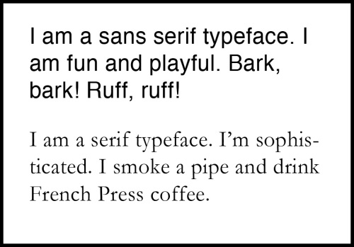
Just in case you’re unfamiliar with the difference between a serif and a san serif typeface, allow good ol’ Nik Parks to demonstrate.
PETLAND just looks depressing to me. If I had a pet, there’s only one scenario in which I would send it here—if my dog attacked my neighbor and I had to put him down. I’d probably choose this place because it looks cheap.
Well folks, it has been fun. We’ve discussed color psychology and typography. Very fun, indeed. Now you know the difference between a serif and a san serif.
By the way, I did in fact survive the hurricane. Thanks for all of your thoughts and prayers. I’m glad it was subdued by the time it hit NYC. Either way, I left New York and sought a safe, dry place.
Again, thanks.
Nik


Hi there, just required you to know I he added your internet site to my Google bookmarks due to your layout. But seriously, I think your net internet site has 1 in the freshest theme I??ve came across. It extremely helps make studying your weblog significantly easier.
Wow! thanks a lot, Divina! I really appreciate the compliment. I actually spend a lot of time on the design. It’s not easy to make a a site about bad design look good, haha.