Big things have been happening on my blog. Because I am now advertising, the amount of traffic has more than quadrupled! Life is good.
If you’ll recall from an earlier post, I was in East Harlem the other day. I stumbled across one of the greatest atrocities that has ever happened to the world of typography.
Jokerman!…
I apologize for having such a poor quality photo, I had to use my phone. I wish I could go back and take a decent picture with my camera but…yeah…it’s night time right now. East Harlem is not the safest place to be at night! I could take my camera but “shooting someone” would have a very new meaning for me.
This is what it says though:
When I was in the 8th grade, my class spent a week in a sex ed class. At least, they claimed it was. Sex ed, is short for sex education. This usually entails educating about sex, right?
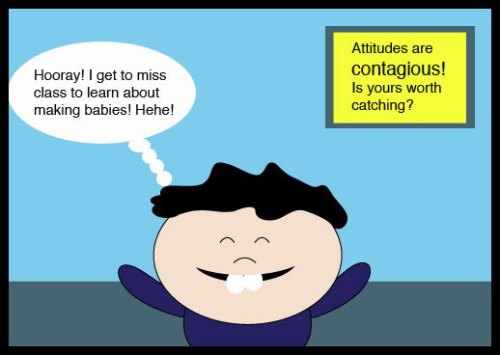
I’m not going to lie, I was pretty excited about the class. This was my initial reaction:
But it ended up more like this:
Scare tactics, that’s all it was. They tried to coerce abstinence by fear.
They showed us gruesome slides of STD’s. They never explained the benefits of abstinence. They never said that it would bring counterintuitive peace and simplicity. They just said, “Here’s a vagina with warts. Very painful warts! Do you want this, ladies? Then don’t have sex until you’re married. Here’s a penis that is turning black, fellas. It burns when he pees. Do you want this to happend to you? Then don’t have sex until you’re married.”
I’m going to shed a little light on my views (blogs are about transparency, after all). I am a big proponent of abstinence. But fear can not be the driving force. And you can’t coerce someone into being abstinent. If fear is your foundation, you’re going to fall…and you’re going to be uneducated on the subject. The stakes are high in that game.
If you’re wondering what in the heck this has to do with a laundromat sign: Jokerman is the STD slideshow of typography. It’s hideous. It’s scary. It doesn’t get the message across. It also looks like it has weird, hairy, abnormal growths.
Here’s everything you need to know about Jokerman:
Non-designers don’t know these things. That’s why this blog is absolutely imperative to your existence (designers also have a tendency to be a bit dramatic at times). But seriously, this does ensure the need and practical application for my industry.
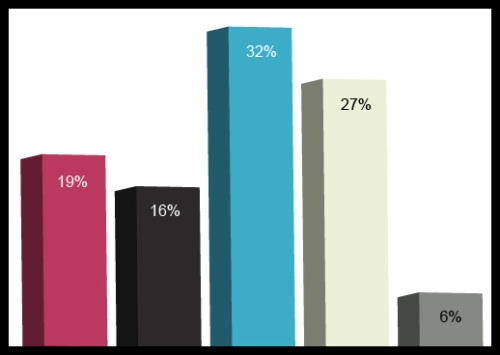
Remember those people I surveyed for the Halloween costume logos? This is what they had to say about these typefaces:


